📱 Download
Source Code
Background
2020, it was the year of breakout of Covid-19, that forced all of us to rely on digital platform no matter how critical some of us were towards digital addiction. We connect, we share, we emphaempathize with each other through various platforms on the digital world.
Still, censorship of content has been tightened unfortunately in mainland China. One of the social media platform named Douban which dedicates to discussions of movie, music, book, etc. also seen highly unpredictable taken down of user generated contents. This triggers a flow called Douban Refugee that many start to abandon social media platforms in mainland China, seeking alternative solutions to share freely.
This brings a boom of introduction of Mastodon, a decentralized social media platform that not only is free from censorship, but also maximize controlling of each’s data. Although a decentralized platform like Mastodon does require more involvement such as setting up own servers, many take the courage, following tutorials, some even without any technical background, setting up their own platforms to welcome Douban Refugees.
In light of this movement, it is evident back in 2020 that there are almost none user friendly mobile clients for Mastodon. There are few solutions with good designs but charges, and only exists within Apple’s ecosystem. With the aim of contributing to the community and to this movement, I decided to take my quarantine time to build an enjoyable mobile client for Douban Refugees.
Process
My spare time of building multiple web solutions for SMEs allows me to level up on using React and JavaScript based technologies. React Native thus becomes the top choice, after evaluating the benefits of other frameworks such as Flutter. In a mobile application environment where users’ tolerance of failures and glitches is much less compared with website environment, a familiar framework contributes to the stableness of the final outcome.
Decentralized platform
Over past years, several addictive centralized platforms stick with many users in various forms. Based on their dominance, users are forced to accept whatever information they provide even though this has always been a hot topic. I remember when LinkedIn joined Facebook-alike to make their timeline not “timeline” anymore but suggestion based, as a user, I have no choice but to continue using their service in professional settings.
Decentralized platforms, on the other end, take a different standpoint that data belongs to all users, and there is no more “recommendation” by harvesting user data. Technically, without centralized computing power, such recommendation service is also not that feasible. From users perspective, how can we adapt ourselves back to a no recommendation based digital workld? And how can I design information display that still invites users to explore inside a linear timeline?
Open API yet “closed”
Platforms like Mastodon are open source, and have existed for some years where many people continues to improve it. Though there is hardly one solution or design that satisfies everyone. In open source world, this easily leads to complicated service offerings, similar to a corporate environment.
To build an application that connects to an existing protocol, understanding how data is structured and shared is crucial. While exploring Mastodon’s API, difficult decisions need to be made on what data is essential to be included, and why are they meaningful. By trying out existing third party mobile apps, immersing myself in its ecosystem, observing how other users are using it, I aggregate my learnings into practice, setting up tooot’s foundation structure.
Where am I in the app
My previous experience of cleaning up H&M’s app sets a clear starting point to define tooot app’s structure. The core consits of 3 needs: 1) what I can read; 2) what I can write; 3) what I have done. Bottom tab navigation is by far the best navigation approach when above purposes can be defined clearly.
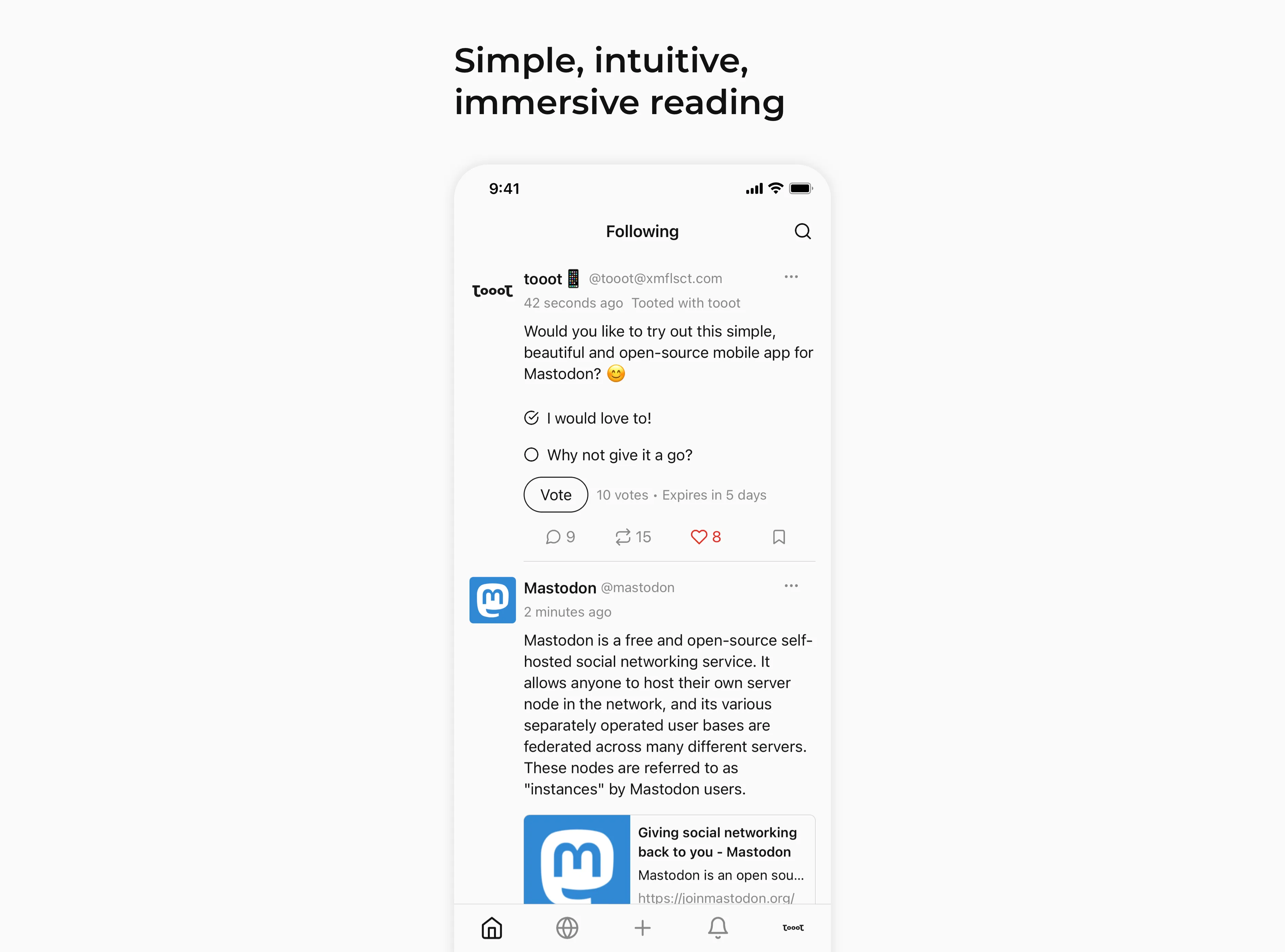
In tooot, 2 tabs on the left dedicates to different timelines that a decentralized platform normally offers: my timeline, timeline on this particular server, and federated timeline. During closed and open beta period currently, there are user feedbacks suggesting to open up customization possibility of these timelines. This is yet to be discovered further after MVP.
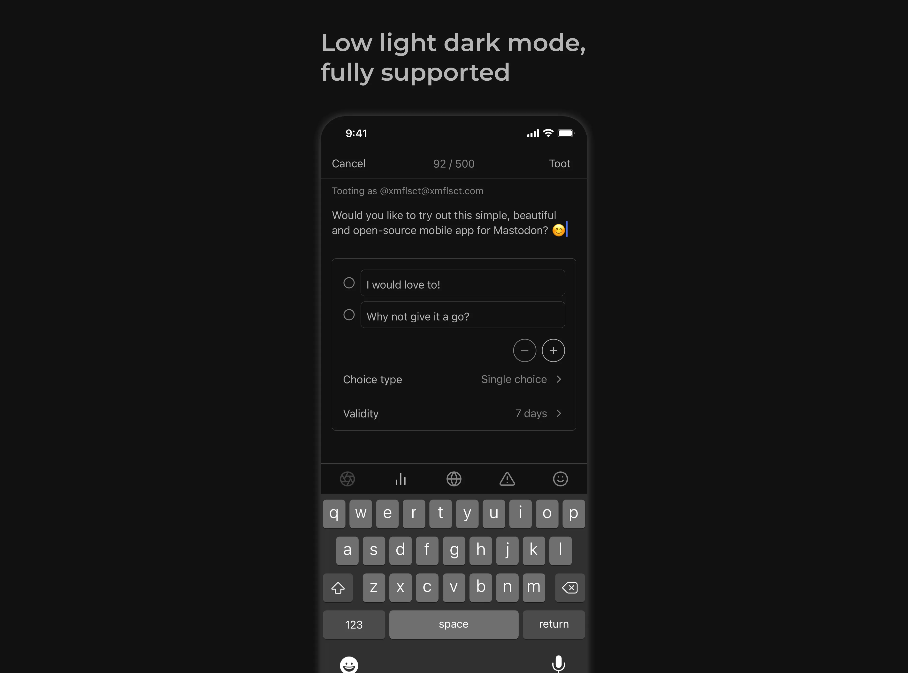
The main tab in the center is where users can post updates. Unlike centralized platform that encourages users to post in order to retain his/her connections, observation suggests that, at least within Chinese community, willingness of posting or sharing is high when you feel you can connect to others easier without the worry of being censored.
The last 2 tabs focus on what a user has act upon, such as notifications, bookmarks, etc.
Technically, there are many “pages” that are shared between all these tabs such as the page to view a specific post. When building it, I learn a lot about that most times, it is not as simple as saying “let’s build a new page”. In order not to break above core navigation principles, retaining the scalability as well as user needs, threads need to be connected among all these considerations; or translating into a corporate setting, it is the true sharing and connecting between business, technology and design.
Practice
Currently at open beta stage, aiming at releasing first production version in April. Bugs fixing and minor experience improvements are being focused.
Main user feedbacks during this stage suggest below 3 key points:
- Various browsing needs
- Timeline refreshing behaviour improvement
- Support of similar decentralized platforms
Mastodon has followed a similar approach to Twitter that offers customized listing views. Furthermore Mastodon’s API as well as its official web client offers much more freedom to define customized way of filtering a timeline, such as based on certain saved hashtags, excluding fediverse, etc. There is no motivation from my perspective to provide a “main timeline” where like Twitter that personalized feed as well as inserting advertisements, still, what kind of structure and interaction pattern that can support such highly dynamic need will be explored after version 1.0.
Stay tuned!


